Showing posts with label scrapbook techniques. Show all posts

Thursday, October 16, 2014

O Tiny Christmas Tree! O Tiny Christmas Tree!

Seeing as I rarely post to this blog (are you all super sad?), I decided to show you a little project for Christmas time.  Something in advance!  woot.

For starters, this is a simple little project using just a few items/tools:
  • gold thread
  • a Tim Holz bottle brush tree (comes in a pack of 5)
  • Heidi Swapp Gold Lame' Color Shine (I am almost OUT!! yikes!)
  • a handful of Freckled Fawn wood veneer star-ish shapes
  • hot glue gun (and glue)
  • a cardboard box


Start Here. :)


I started out by spray painting the wood veneer star shapes. (NOTE: I ended up needing 50% more than are pictured here.) I usually put a scratch paper in an old Studio Calico box. The pizza box style is great to catch the over-spray, and compact enough to close up and put out of sight when done.

A couple squirts was enough.  I just pushed them around to cover on both sides.


This Color Shine is seriously amazing. The goldey-shiney-sparkley goodness is unattainable in photographic form!


 I then hot glued the little stars along a length of gold thread.  Word to the wiser-than-me: don't squeeze a crap-ton of boiling hot glue onto your fingertips and scream like a little girl.  I'm sure you wouldn't anyway, but take it easy out there.  I spaced them approximately (because I did NOT measure) 1/2 inch apart.


 Now, I am not one to brag - but I am a genius.  The little tree kept falling over.  They are made out of whisps of the wind or something.  So - BAM! - my genius thought hits me: "Stacey, use those removable Glue Dots that you have never used and are entirely useless for nearly* everything else you do!" So I applied on to the tree "trunk" and it worked! It really did! It stayed standing!

(*note: to be fair to the otherwise lovely Glue Dot Corporation, once I used these particular Glue Dots to hold an envelope closed so I could open it again)


 Look how cute this tiny little garland turned out! Gold. Bam! Instant awesomeness.
I also glued one of the stars to the top.  Every tree needs a topper.  Amiright?!


String the little garland around your tree, and voila!  So beautiful and simple.  AND GOLD.  I'm dreaming of a white (and GOLD) christmas.


Just add Frankincense and Myrrh.


Much love and cheer,
Stacey

Wednesday, July 16, 2014

This is a scrapbooking process post

Sorry to all you multitude of blog readers who check in to read all about my emotional waxing of poetic verbiage regarding my life, God, and other random thoughts.

This blog post is only scrapbooking.

Last month I took these photos with my cell phone as I went through the steps to complete this scrapbook page about my son's birthday:  


As you can see, I started with a sketch.  This particular one was from a blog post from Studio Calico.  On the left you see my stack of photos with the sketch, and on the right my completed page.


And, now for the excitement!  The process is simple:

1. I cropped my three photos to the same size (3.3x4.5) down from the standard 4x6.


2. I trimmed my white cardstock down 1/2 inch on two sides.  This creates a nice frame to show on the background orange cardstock.


3. I laid out my photos and measured where I wanted my title to go.  


4.  I cut out my son's name with my Silhouette Cameo. 


5. I backed all my photos with a different pattered paper - leaving a very thin border.


6.  I decided to back my die-cut title with various patterned papers.  So I trimmed small rectangles out and glued them to the back of the die-cut white cardstock.


7.  Here is how it looks from the front - with the photos adhered also.


8. I adhered small foam Thickers to the title by first sticking them to a ruler.  Then I moved the ruler (with the stickers on it) around to decide where I wanted them.  Once I was happy, I carefully stuck the top half of the Thickers in place and peeled away the ruler.  A super easy and great way to get placement right.


9.  Lastly I added three shipping tags to the top of the layout.  When I trimmed the excess off, I reverse mirrored them along the bottom.  This continues to draw the eye down the page, past the title, then photos, and to the journaling.


So that's how I went from sketch to completed page:


Easy, Peasy, Lemon Squeezie!


Have a lovely day,
Stacey

Monday, January 20, 2014

World domination with C.R.A.P.

Once I read a book about design.  Ok, I have read a few.  One awesome book gave a VERY memorable acronym for the design principles of Color, Repetition, Alignment and Proximity.  

C.R.A.P.

Isn't that memorable?

Use the principles of design to get people to look at what you want them to.  

And then, you can take over the world! BWAHAHA!  

But, mostly I relate design principles to scrapbooking rather than world domination.  Mostly.  And I want to show you how I use these principles on my pages.   Today, let's focus on Repetition.  Repetition.  Repetition. The following three scrapbook pages use circles repetitively.

Simple, really.  Take one thing.  Then do it again and again!


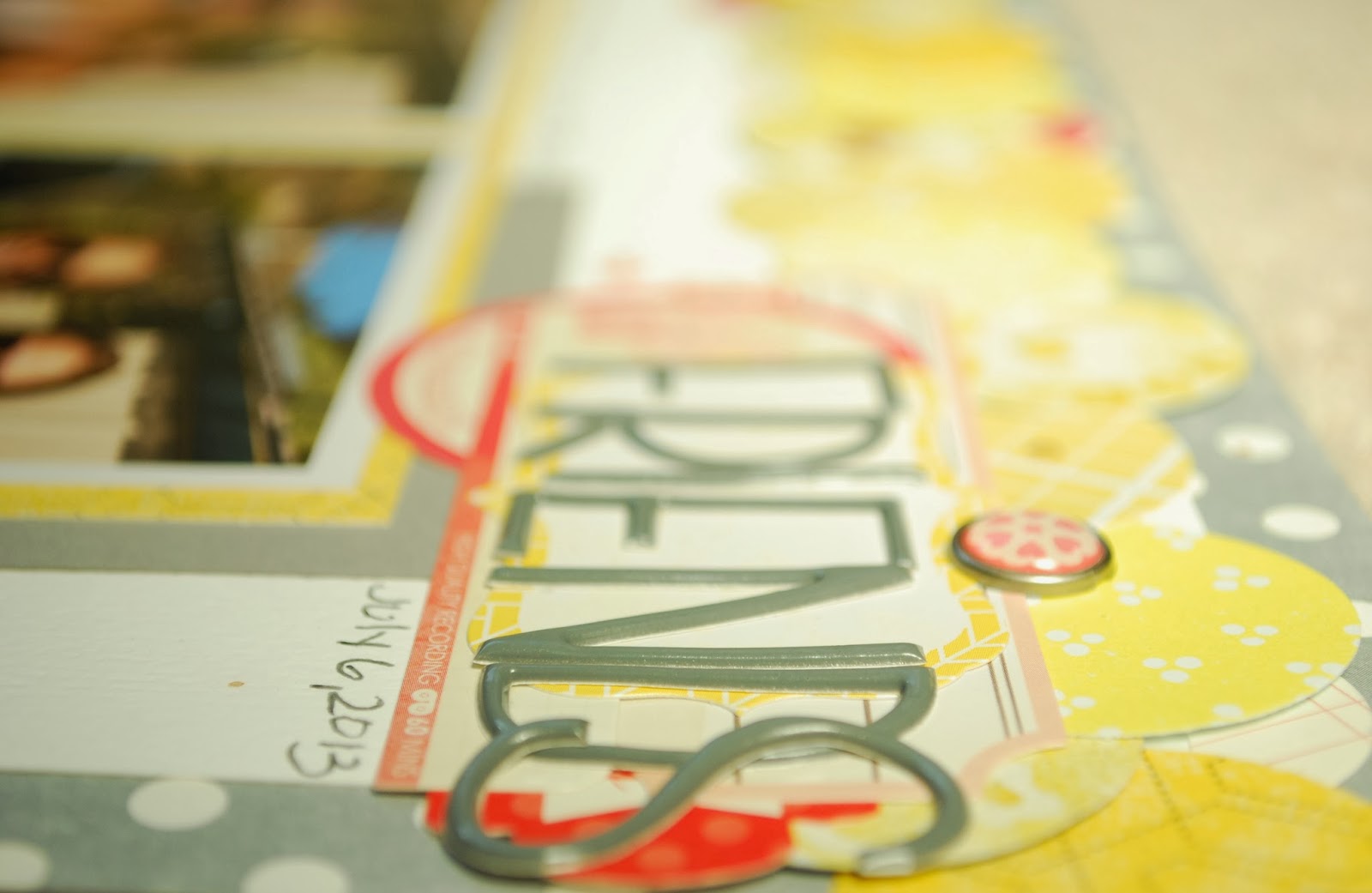
Page 1 "FRIENDS"
Color: Monochromatic, with a contrast accent
Repetition: color & shape
Alignment: equal margins, symmetry
Proximity: lined up circles, groups of contrasting red


Here I've used a circle punch with a bunch of my yellow scraps. 
Repeating the color yellow, as well as the circle shape.


You will notice that I ALSO repeated the line of circles.
A lined up group of circles up top, and also down below. 
I (hopefully) have used repetition of colors and shapes to get you to look at the photos.


Lastly, notice that I use a contrasting color (red), 
and repeat circle shapes throughout. 


Page 2: "FUN on the Fourth!"
Color: contrasting
Repetition: color & shape
Alignment: assymmetry, title sits on a line
Proximity: triangulation


More circles!  This page utilizes a white die cut paper from Jillibean Soup.  
I filled most of the holes with repeating yellow or blue scraps of paper.  


Check out the how the title pieces are placed.  If you follow from the word "FUN"
to "on the FOURTH!" and then over to "2013" it makes a triangle.  Go ahead. 
Trace it with your finger on the screen!  The imaginary triangle makes the eye follow around the page; totally framing the photograph.  Which is, of course what I want the viewer to notice most: the photo!


Then you will notice the blue and yellow embellishments scattered around.  
I have repeated color, shape, and even type of embellishment for visual interest.
Lots of "triangle" placement is repeated as well!


Page 3: "XO XO XO!"
Color: triadic, contrasting
Repetition: colors & shapes
Alignment: groupings, title sits on a line
Proximity: circles in circles!


 More and more circles!  This time I used a circle punch to cut four circles from each of 
the papers from the Crate Paper Love Notes 6x6 paper pad.  I used a couple plates to
pencil concentric circles on the cardstock to more orderly place my circles.


 Repeats: circles (duh), sequins, washi tape, arrow clips, wood shapes, and colors!
All these elements point to (literally with arrows!) the photo.


Thanks for repeating with me today!


Thank you, thank you, thank you,
Stacey

Saturday, January 11, 2014

Ac - cent - tu - ate the Negative.

But do not e-lim. In-ate the positive.  USE BOTH!!


Figuratively, both negative and positive experiences in our lives shape us into the person we are. 
Literally, both negative and positive scrapbooking items can shape up into amazing layouts! 

Yes, I spend too much time thinking about scrapbooking.

Below you will see some simple snapshots of my utilization of a scrap piece of white cardstock, some Heidi Swapp color magic letters, and HS Color Shine:  


I lined up the letters SO CLOSE together, because my cousin and I used this phrase as our hash tag to link up all our Instagrams of our Hawaii trip together in June 2013.  Check me out if you want: Stacemaee.

NOTE: When setting the letters, be gentle and don't push them down.  This way they will not stick to this paper & can be used on another project!

I used Pink on the left and faded it with Coral on the right.  Just a few sprays each will do...


Remove the letters...
And you will have two great items to use!


I trimmed the misted cardstock down, cut a triangle notch out of the right side to create a banner, and handdrew a fine black line around the edge for some definition.

And here's my final project with it!
 (this page has all Fuji Instax photos, FYI.  They are so fun!)


And here is the next page & use of the actual letters:


Because the box I spray/glitter/emboss in had so much powder and other overspray, the letters were not very sticky.  I was worried they would fall off, or that my hand would fall off trying to glue each one individually.  SOoo, I just ran it through my sewing machine.  Super easy, as long as the sewing machine is already out!